
Day two of the Modenus Blog Tour was opening day for the 51st annual Kitchen and Bath Industry Show (KBIS). The Bloggers were given an inside peek into many of the booths at the show and as we toured, trends most certainly did emerge.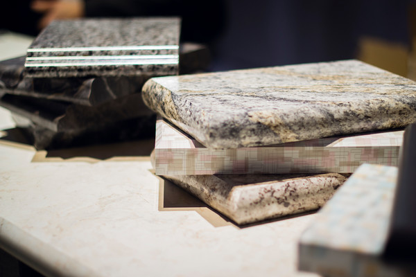 "There is a three year lag between Europe and North America when it comes to trends", says Warren Ramsland, President of Top Knobs. Taking that into account, there were many differences between what I saw here and what I witnessed in Italy at Euro Cucina last year. Perhaps the biggest European influence that continues to pick up steam is contemporary design for both the kitchen and bath.
 Laminates are enjoying a serge in popularity. This material is more widely used and experimented with by our friends across the pond but we're picking up speed. I was wowed by the offerings at Wilsonart who debuted their "Spirit of Mindfulness" collection of 27 exciting laminate colors and textures. Also introduced were a line of quartz counter tops in a great assortment of neutral, workable hues. By late spring, a selection of 50 patterns will showcase a full range of colors, textures and four structures: Fine and Small Scale, Medium Scale, Large Scale, and Veining and Movement. That is one of the things I love about quartz, the wide variety of pattern, or no pattern at all! I was impressed not only by the innovative product development at Wilsonart but also their philosophy. This press release statement says it all:"Fueled in part by a turbulent economy, today’s more budget-savvy and eco-conscious consumers have responded by making their homes the calm eye in the storm of life. For many, this translates to finding a spirit of mindfulness within themselves and expressing it in their surroundings."
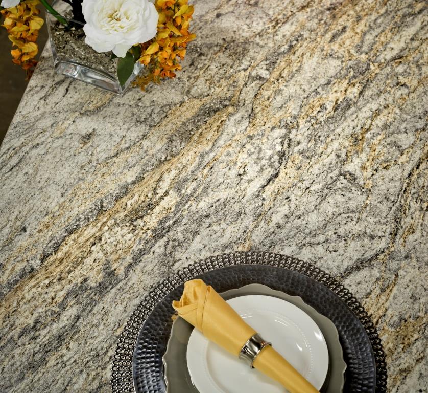 One of the new Wilsonart quartz options showing beautiful veining. Photo courtesy of WilsonartCheck out the Wilsonart Visualizer to help you pick your counter top color. It's easy, fun and very helpfulTechnology is also taking the kitchen and bath world by storm. There were numerous examples but two stood out for me. A company called TechTop took home the Best In Show Award for their counter top charging technology. Simply place your phone, tablet etc. on the counter top and viola' it will charge, no plug-in required.
  This great idea is from LG Hausy, yes it's the same "Life's Good" LG that makes appliances. They make counter tops too. I also loved this Solna articulating faucet by one of my favorite brands, Brizo. How convenient, right?!Fifty Shades of Gray has moved on to what I call "greige". It's the new warm toned beigey-gray which I saw everywhere! Palettes are definitely neutral. A great example is the Tangent collection by Walker Zanger. Love the mid-century inspiration which I also saw a lot of at the show.
 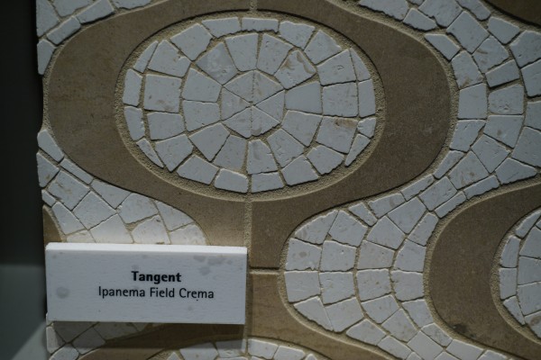 Walker-Zanger deals in tile, marble and stone artistry. Their collections are arguably the most innovative I've seen. Case in point is their Sterling Row collection, inspired by menswear and a favorite at the show. I found it to be extremely sophisticated, eye catching and innovative. The collection was a favorite at the show.
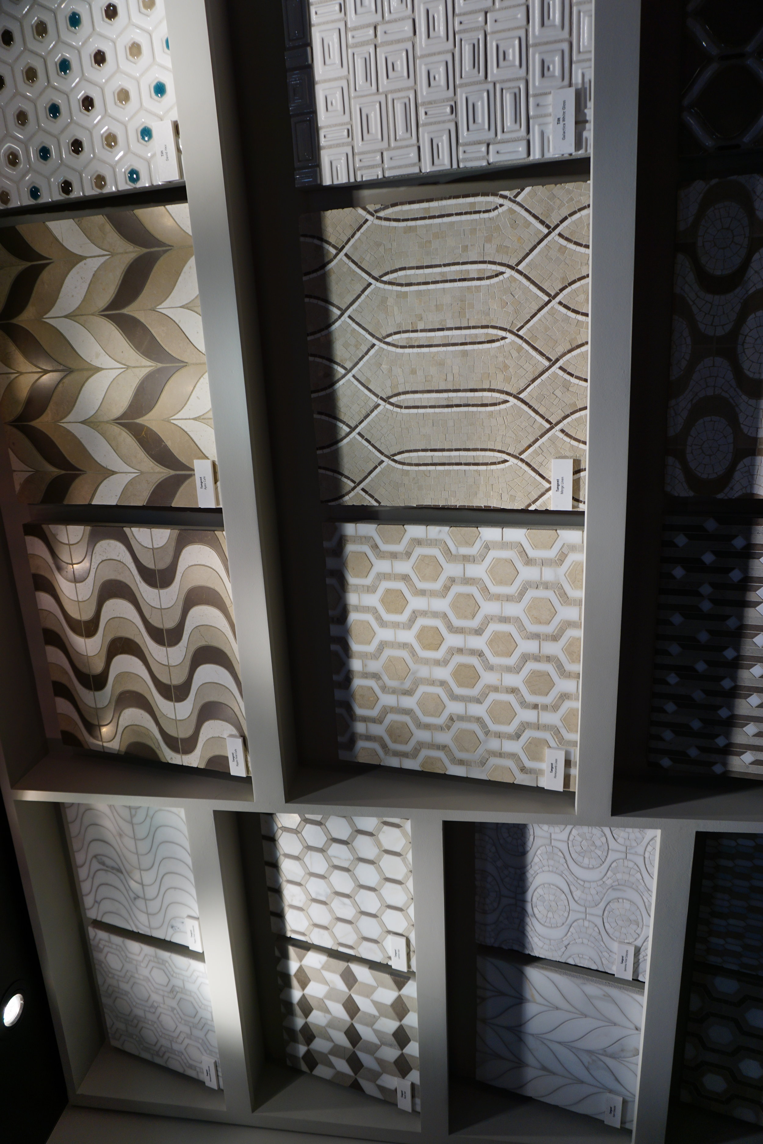
 We saw more of the Sterling Row Collection later on the blog tour in The New American Home, so there's more to come!Perhaps the BIGGEST trend of the show was personalization. I mentioned this in the last post about Thermador but they were not alone. Here are a few more pics highlighting the concept. Frigidaire's SpaceWise Custom Flex refrigerators allow you to totally customize the shelves inside by moving the drawers and shelving to your desired configuration.
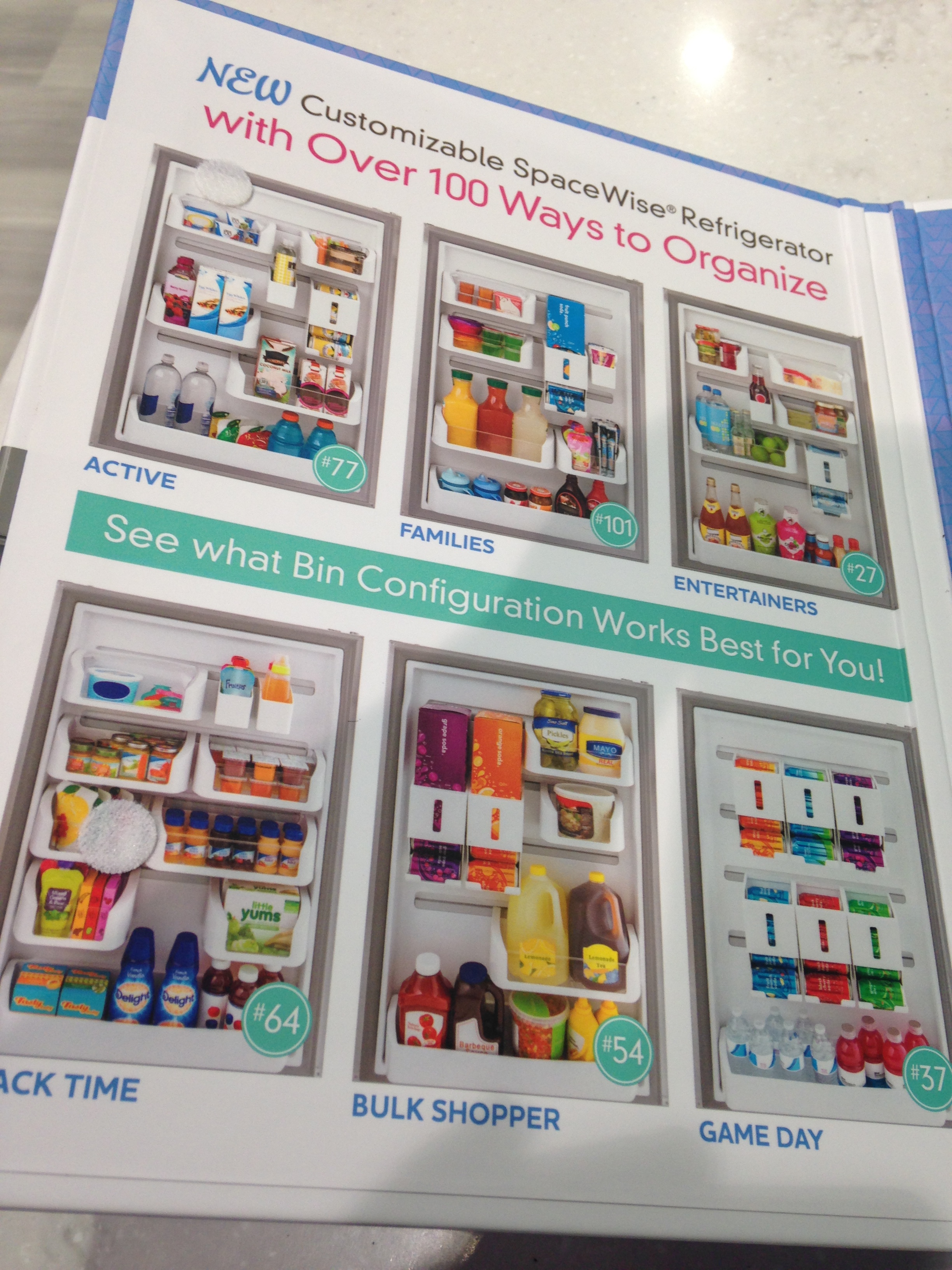 How about this great storage system by Rev-A- Shelf? I know we all want this level of organization in our lives, yes? Right now this is a prototype but the response from the industry was good so I think we can expect to see this in the coming year.
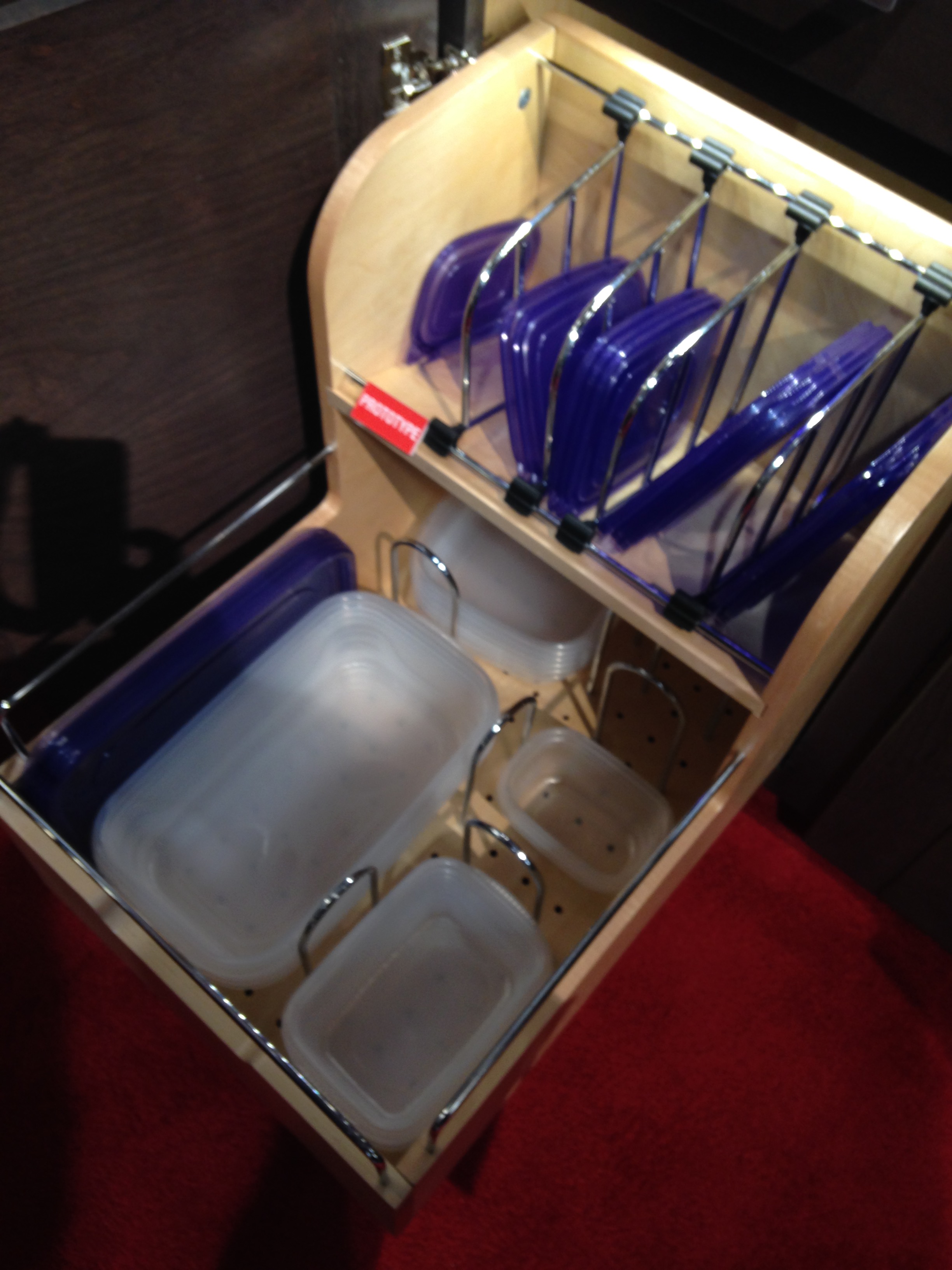 Enough for now? Well there's more to come.Up next: KBIS 2015 Part II where I'll tell you about all my great finds for the bath and more.
Color Your Kitchen for a Pop of WOW!
Whether your kitchen is New York City closet sized or vast and expansive, a skillful use of color can make it pop with interest or blend into adjacent areas. Bold colored cabinets are certainly a commitment to say the least but also remember that a little goes a long way.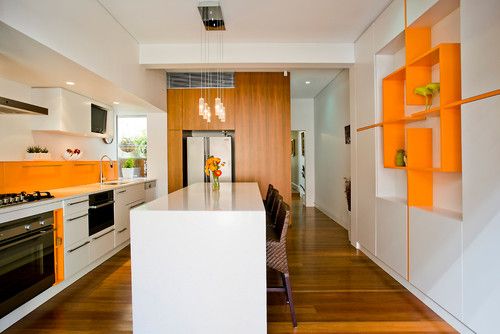 Just a few doors in a vibrant red or juicy green create a focal point of visual interest that might not even be as effective if you covered the whole kitchen in it.
 Another way to use colors is on your walls. After all they are the backdrop for your cabinets, plus they’re much easier to change if you need a new look.
  Fun accessories or a dramatic backsplash can do the color trick too! You can find more kitchen love on my Pinterest Kitchens board right here. If you have kitchen questions I'd love to hear from you. Leave a comment, drop a line...
Hip To Be Square, Or Not
I've heard the saying " it's hip to be square" but that’s not always true, sometimes curvaceous qualifies. Here are three of my fave new products that sport some cool contours and are far from square. 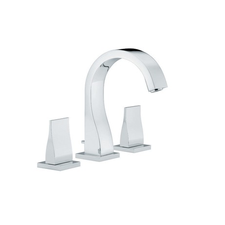
 Sometimes just the slightest suggestion of a curve is enough to soften a silhouette. This beautiful faucet by THG Paris is available in, get this, 35 finishes! The French excel when it comes to subtly, oui?
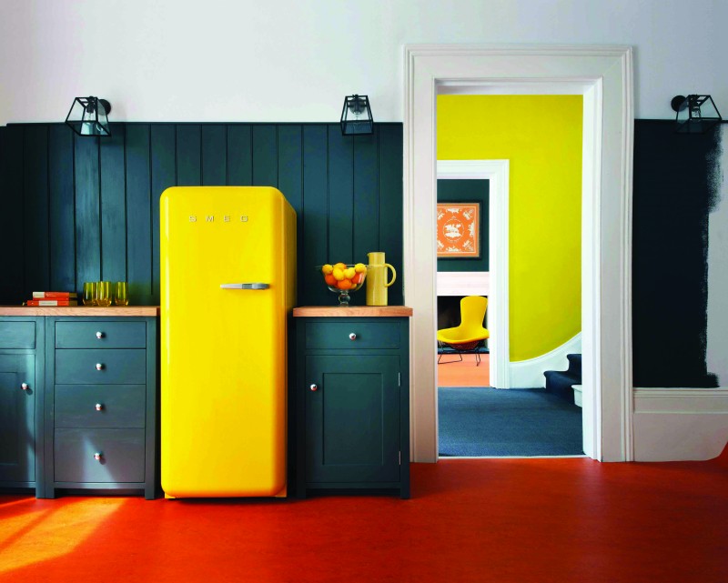 This is what you would call a "statement refrigerator"! Smeg is an Italian company largely known for these cool retro-style fridges. The other new colors just introduced are white and a highly anticipated Union Jack pattern (who knew?). The soft rounded corners are all about the 1950s. The 9.22 cubic foot capacity is a little more Euro than American but who can resist those sinuous lines and vibrant colors combined with cutting-edge technology?
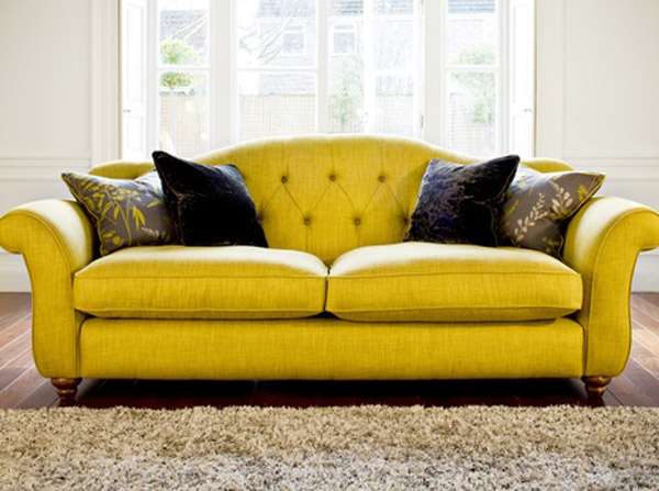 I even found you a sofa to partner with your new yellow Smeg :) Not bad, I must say. Last but in no way least is Infiore by Estiluz. It's a beautiful stylized flower sculpture masquerading as a lamp. This one is a pendant but it also comes as a floor or table lamp. The petals are available in different colors and sport a collection of bi-injected polycarbonate petals. I have no idea what that means but I do know it means the lamps feature an interesting two-color lighting effect. These are available at LightingbyGregory.com
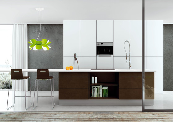 The organic curves of Infiore add a whimsical softness to this very linear contemporary kitchen (which I love) The larger-than-life scale also makes these flowers fun! I rest my case, curves are a beautiful thing ;)
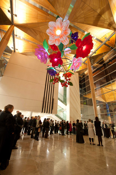
Dreaming of a White Kitchen...
I’m always designing, writing about and thinking about kitchens. It’s what I do. Today I started thinking about what MY dream kitchen would look like and thanks to our uber talented design pals over at houzz.com I think I found it.

It’s this stunning kitchen by Shannon Pepper Designs in New Zealand. Not only is it a visual pleasure, but it would also be a blast to cook in! It features glossy white cabinetry with contemporary slab fronts, white marble counters and a stunning red painted glass backsplash. I’m loving how the red is picked up by the bar stools too. I love, love, love. I wonder if she calls this “Pepper Red”? If not, she should!
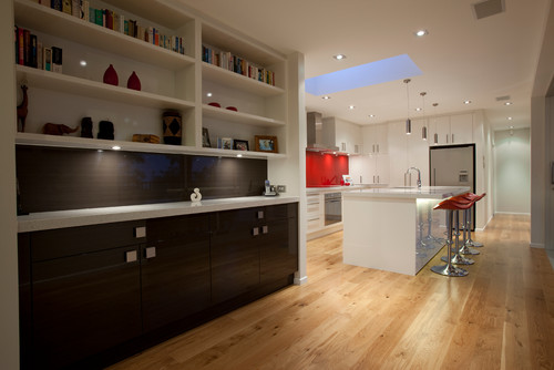
I also love the contrasting cabinetry in the adjacent bar. Now for me I must confess I would tweak just a couple of things because that’s what I do. I take a dream and I tailor-make it to suit YOU. But wait we were talking about me today! I would have run that HOT “Pepper Red” backsplash all the way up behind the hood and I would have lowered those upper cabinets because I’m short and because it would give me more storage. Something like this: As they say, a girl can dream. Wishing you and yours a very Merry Christmas, Happy Holidays and tons of beauty, love, health and prosperity in the new year!! Thanks for reading Kitchens for Living. XOXOXOX
Tip 2: New Cabinets, All or Nothing?
Contemporary Dining Room by San Francisco Interior Designers & Decorators Artistic Designs for Living, Tineke Triggs When mixing, a total contrast works best.
Anyway where were we?? Ah yes, I was sharing with you five big questions I get from clients. The first post in the series was about under cabinet lighting and here is number 2:2) Some of my cabinets are still really good, can I save money and just get more to match? While at first thought this may seem like a great way to save money, usually it's not. Even if your cabinet doors are simple, chances are you've had them a long time so the color may have changed. Also, each cabinet manufacturer makes their products slightly different so unless you can locate the original cabinet maker matching will be a challenge. Styles also get discontinued. If you're going to use a custom cabinet maker to replicate what you have you might as well just get new cabinets (unless he's a very very good friend). If you work within standard sizing parameters you can get some very good quality cabinets in today's competitive market. That said, there are some situations in which you can have the best of both worlds. Two toned kitchens are very popular. If you are replacing some cabinets, consider getting something totally different but complimentary to what you already have. Every situation is unique and it's worth investing in a little consultation with a kitchen design professional to see what can work for your case. The design solution below works because the lighter maple of the upper cabinets is picked up in the flooring. Usually I prefer to see a darker finish on the bottom rather than on the top. Darker colors are visually "weightier" so there is a "grounding" effect when you use them on the bottom. The operative word is "usually". Never say never as shown in the photo above. I love it. It works beautifully in this design. Lesson is don't be rigid. Think outside the box, pardon the pun!
A word about refacing- Refacing your cabinets means you will be replacing your drawer fronts and doors. The cabinet boxes themselves will remain including the drawer boxes. The thing to consider is that most of the cost of a cabinet is in the doors and drawer fronts. Along with that all exposed surfaces such as the ends and the frame around the front will have to be veneered or laminated to match the new doors. Depending on your existing cabinets, this could be a very labor intensive process resulting in less savings than you would have thought. One situation where I would recommend reface instead of replace is if you have already have great countertops which you now have a vested interest in saving. Then perhaps it would be worth it. Also, bear in mind, a reface doesn't allow you to improve your layout or add drawers. Whether new cabinets or just new doors and drawer fronts, remember that a clean simple flat slab style door is always the easiest on the wallet.Next up: #3: Where can I save money and what items are worth the splurge?
GREEN WILL COLOR 2013
 It's official. The "color gods" have spoken. Who are these "color gods"? They would be an organization known as Pantone. Pantone, Inc. is the authority on color, provider of color systems and leading technology for accurate communication of color. The market leader in color has officially named Emerald THE color for the year 2013. When I think of emerald a number of things come to mind including: my birthstone, mermaids, deep sea, summer AND then I think about all the other greens and how we use them in our interior environments. One thing I love about green is that it brings outside in. As Pantone notes here it represents regeneration, healing and unity.
 Just for fun I thought I'd share with you some of my fave Houzz.com ideabook finds containing the color green.
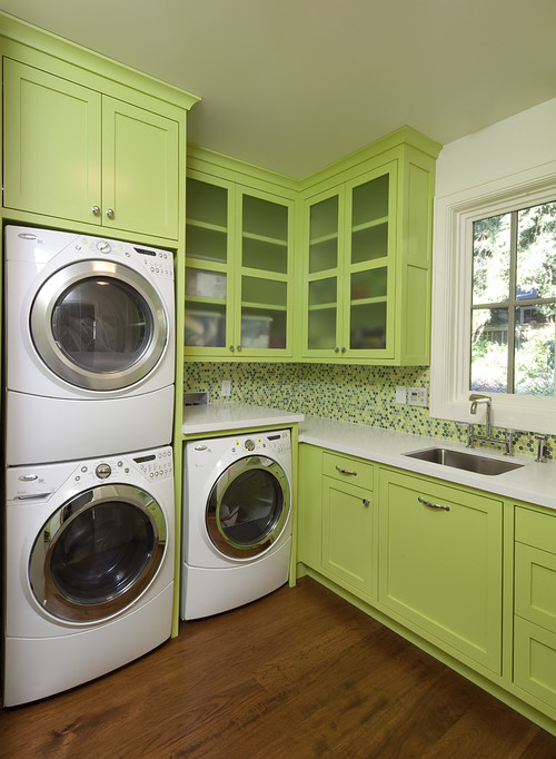
Contemporary Laundry Room design by San Francisco Interior Designer Artistic Designs for Living, Tineke Triggs
This is another kind of green that I love. It almost makes me want to wash clothes.

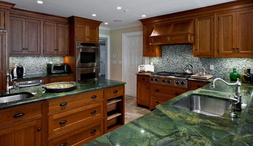
These green marble tops definitely bring the lovely outside in. Hints of brown tie in the warm wood cabinets.
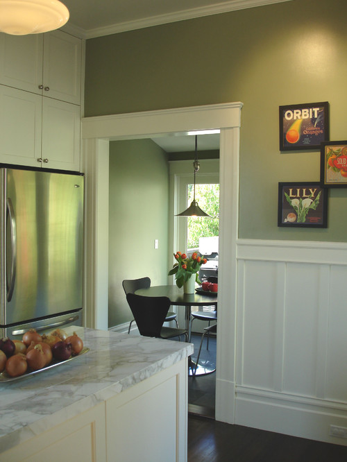
White cabinets are the rage and what better way to highlight them but with a clever shade of green on the walls?
Here's the same color palette, warm wood and green marble. As you can see, it works equally well whether the theme is contemporary or traditional.
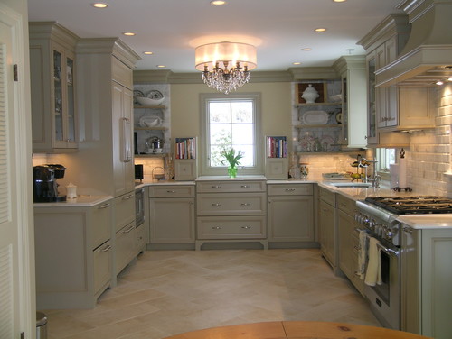
Traditional Kitchen design by New York Interior Designer Marlene Wangenheim AKBD, CAPS, Allied Member ASID
This is a totally different green, almost grey suggesting elegance and refinement. So whether your taste runs to emerald or chartreuse, green is a great option. In fact there are two other greens on the hit parade for 2013, Tender Shoots and Grayed Jade. You can see the complete Pantone Color Report for Spring 2013 here.