One hundred years ago Addison Mizner brought Spanish style to Florida. Incidentally, the state's written history begins with the arrival of Spanish explorer Ponce de Leon in 1513. Functionally, the tall open arches, windows and loggias typical to that architecture invite sea breezes within and were the perfect antidote to our hot steamy summers prior to air conditioning.

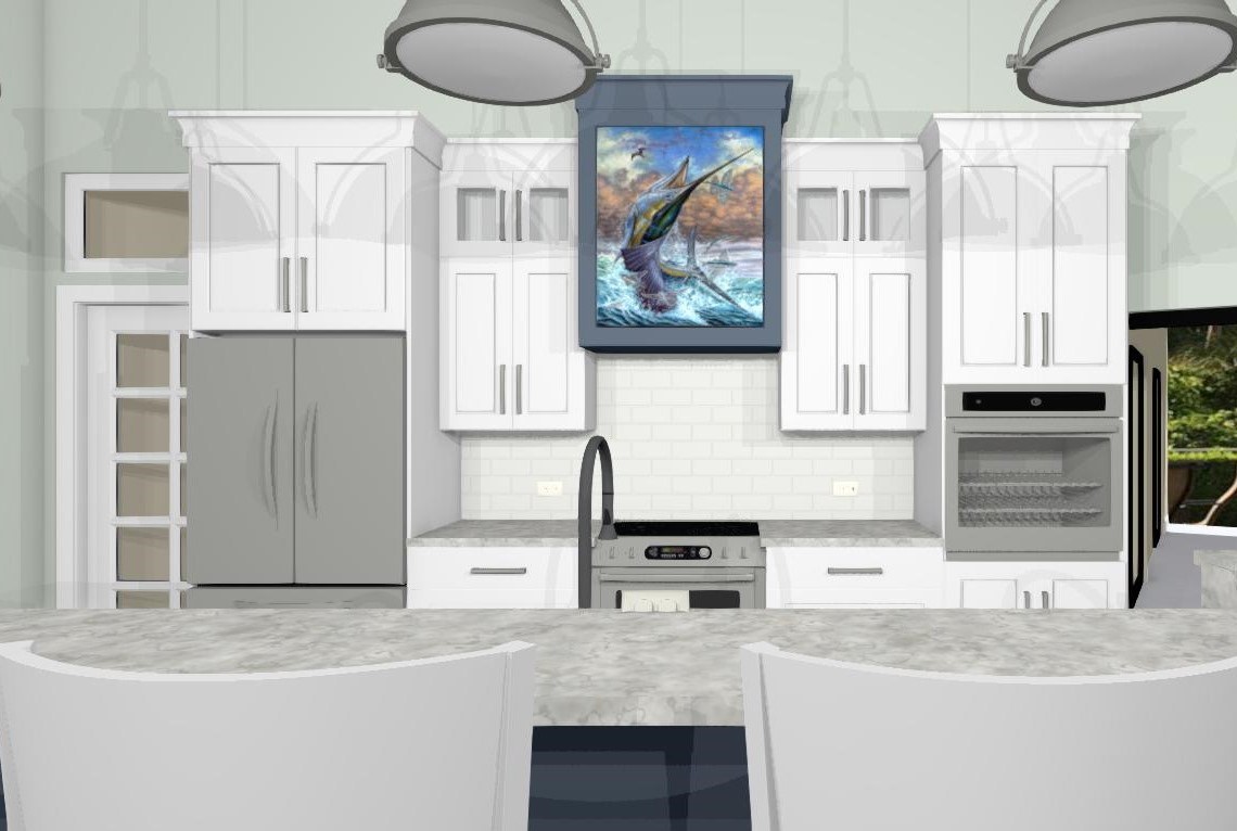
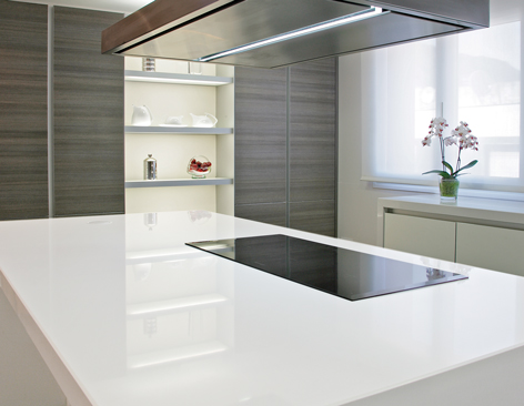
The range hood picks up rich wood tones of the new floor. Counter tops are quartz by Silestone. Photo by Shanna Morgaine
Mizner subtly adapted his designs to suit Florida and its warm climate. Although inspired by the art of Spain and Italy, his structures bear his own stamp and are a defining feature of what we think of today as Palm Beach style.

Addison Mizner’s design for the Cloister Inn, now the Boca Raton Resort & Club, relied on his signature Mediterranean Revival style.
Photo courtesy of the Boca Raton Historical Society
Mediterranean Revival style lives on reminding us of Mizner and his contribution to the Palm Beach landscape.

Addison Mizner with his pet monkey, Johnnie Brown
Courtesy of the Historical Society of Palm Beach County
I was recently delighted to be a part of a kitchen remodel in one such home located in Boca Raton. The homeowners were looking for an updated and functional kitchen for their family. At the same time, they treasure and acknowledge the history of their hundred-year-old home.
Setting the Scene
Design wise I saw my biggest challenge as taking the existing kitchen space plus a butler’s pantry area and making them into one decent sized unified kitchen full of function. At the same time, it had to feel fresh yet look like it belonged in the house.
Challenges of an Older Home

The previous main sink location before we combined the two rooms
Denali Construction Corp, with architect Adriana Finnvold, expertly addressed issues with the foundation which were discovered during demo. They also were able to remove the wall separating the existing kitchen and butler’s pantry. Since we were removing a hallmark arch we added one on the entry to the dining room as well as one in the hallway.
Design Thoughts
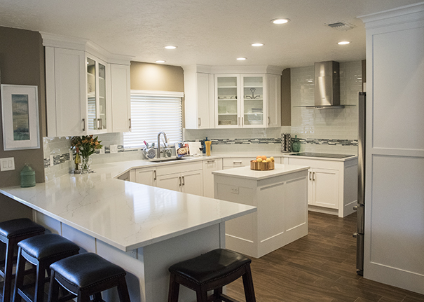
The existing wood floor was in poor shape so it was replaced with a similar but darker wood with slightly wider, more updated planks. We picked up the rich finish with a matching range hood hood, traditional but clean lined. Floating shelves in the same wood material tied it all together and added a modern touch.

Floating shelves add a touch of modern. Photo by Shanna Morgaine
Function & Flow
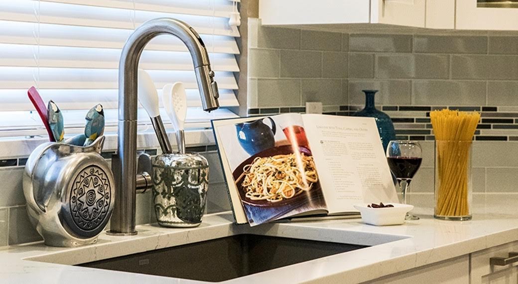
In order to really integrate the old butler’s pantry, I decided to locate the main sink and clean up work area there below an existing window looking out on a courtyard garden.

New main sink and clean-up work zone in former butler’s pantry area
The relocated main sink and clean-up zone with a new arch to the dining room. The apron style sink is the iconic IKON Silgranit sink by Blanco. Photo by Shanna Morgaine.
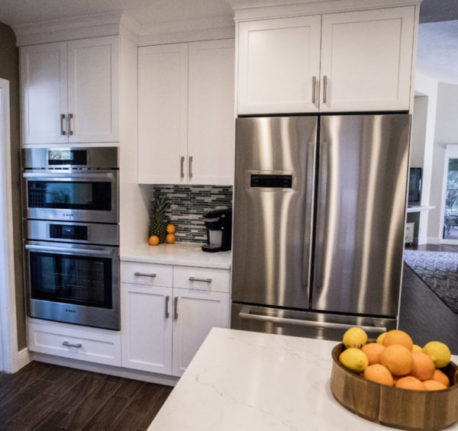
The old kitchen sink became a prep sink, closer to the refrigerator allowing the two separate functions of food prep and clean up to happen simultaneously. Voilá we now had a two cook kitchen.
We also added some glass doors and took the cabinets up to the ceiling for maximum storage. A peninsula provides additional seating for the breakfast area. Bernier Cabinetry by Devine Design Kitchens & More brought this design to life with their careful planning and expert installation. I always say the best projects are great collaborations.
Some Final Words from a Happy Client
See more photos of this kitchen here in my portfolio.