2018 was a year of fun and exciting projects which challenged and sparked my creativity! White kitchens continued to be the hot ticket sometimes with an artful mix of natural wood or with deep rich blues.
I call this the "new traditional kitchen". I had fun working with HW Interiors on this one.
There were difficult situations but always solutions. This video gives you a snapshot of the vast variety of spaces and projects that came my way throughout the year. When you work with me I create these 3D renderings in Chief Architect Interiors X10 so you can get a sense of the space because visuals are everything! I am deeply grateful to my clients for placing their trust in me. Wishing all my readers the best in 2019. Maybe this will be the year we create your new space! xoxo
Every time I think I've seen it all I'm challenged to create a kitchen design that seems impossible! Such is the case with this recent project. This home is located in Palm Beach Gardens, Florida and features not only a stunning view but also the strangest shaped kitchen! Sometimes I wonder what architects are thinking.
coastal kitchen watercolor render blue island chief architect kitchen design
Step 1- Let there be walls
(to scale and correctly angled)
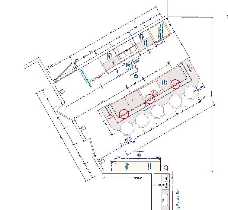
I can't even begin to design until I can get the walls drawn to scale. I had a physical blueprint which (after some quick research) I was able to trace over in my design program (Chief Architect). Once I did this I discovered those angles are 30 and 60 degrees, not the typical 45! There was no possibility of changing the shape of this kitchen.
blue print kitchen with angles
Step 2- Embrace the Space
One thing I have learned is that you will never win by trying to fight the space you're designing. Honor it, whatever it is, if you can't change it. That is the only way to end up with a design that is timeless and looks like it has always "lived" in the space. In this case, that means embracing the angled main wall while allowing ample and efficient flow.
Step 2- How to make it better
Once I had the walls accurately represented I evaluated the current layout keeping my client in mind. He loves to cook and he and his girlfriend love to entertain. Here are my observations:
-Cabinets are too low, not taking advantage of the high ceiling and limiting storage
-The big POINT on the island has to go! That just jumped right out at me and called for correction
-We are in need of an update and new appliances that are up to the task of my client's cooking endeavors
-The shape of the island does allow for lots of storage but also lots of walking. The sink is pretty far from the main wall.
-With the boat docked outside and observing everything else about the home I knew my clients' style is casual, Florida-Coastal and they are much more "comfortable" than contemporary.
a boat in the back with pool and canal palm beach gardens
Step 3- The Solution
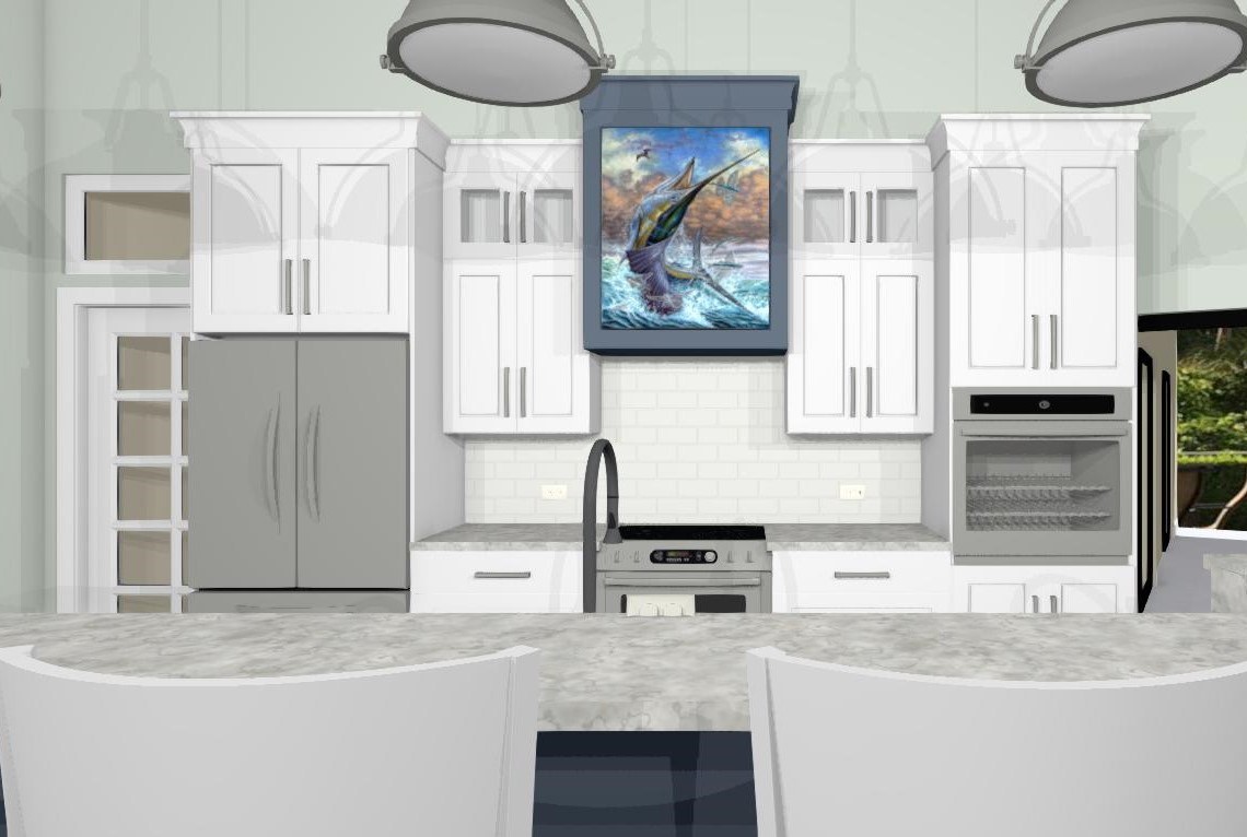
The first thing I did was the back wall. I knew it had to accommodate the refrigerator and the new wall oven my client selected. The fridge and stove were already there so no need to reinvent the wheel. Remember it saves money when you can keep your major appliances in the same, or close to the same location. In the new design cabinets are now eight and a half feet high plus crown molding. The upper, hard to access area, features glass doors to add a bit of style and aesthetic appeal which incidentally the homeowner mentioned he wanted. This is the perfect spot for showcasing a collection and you can change the flavor by changing the contents when the spirit moves you. Versatility is always an important aspect of my designs. We've also got generous counter space next to the fridge, on each side of the stove and next to the ovens, a must! That was the easy part.
white kitchen Palm Beach Gardens coastal style white cabinets blue accent kitchen design
Now for that island. Hmmm. Since I'm updating that means I'm simplifying. I'll honor that angle but I think simplicity will calm the "angle noise". It's a popular trend these days to keep an island all at one height but I didn't think it was the right solution for this project. It turns out I was right and my client was so relieved! This island is really a serious cleanup and prep space and with such an open space a little buffer was needed. The raised bar also makes me think of the captain behind the wheel, it's sort of boat-like. Pulling the island closer to the main wall (still allowing 48") not only reduces the chef's steps but discourages unwanted traffic from congregating behind the island and getting underfoot. Now our island contains all the essentials but, not gonna lie, we've lost a little storage. To compensate I added a section of full height cabinets to balance out the kitchen. Glass panes at top reference those on the main wall. We're keeping these at 15" deep to keep the space open. Another benefit of shallow tall cabinets is that you will do just fine with adjustable shelves whereas, in a deeper, 24"cabinet, you'll probably need roll outs or stuff gets lost and is hard to access in the back. Roll outs really add to the price of your cabinets too.
Step 4- More About Those Aesthetics
Now that the layout is solved I think, what can I do to make this kitchen design stand out and fit my client's personality? A deep nautical blue island and coordinating hood of course! I also loved the idea of creating a spot for an ocean scene front and center on the hood itself. This is a great place to add a painting you love and, again, you can change it up! Voila
awkward angle kitchen floor plan view kitchen design
What do you think of this kitchen design? Are there any elements here you can apply to your own situation? This project is now underway and I look forward to sharing the outcome!
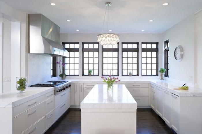
Unless you've been living under a rock you know that the less-is-more look of the topless kitchen is hot!! When I say topless I mean no upper cabinets. There are certainly pluses and minuses to this design decision. But "how can I live without half my kitchen", you ask. Fear not. Today we will examine the possibilities.
white kitchen, traditional kitchen, stainless steel hood, island, white countertop, kitchen windows, crystal chandelier,no upper cabinets
Less is Now
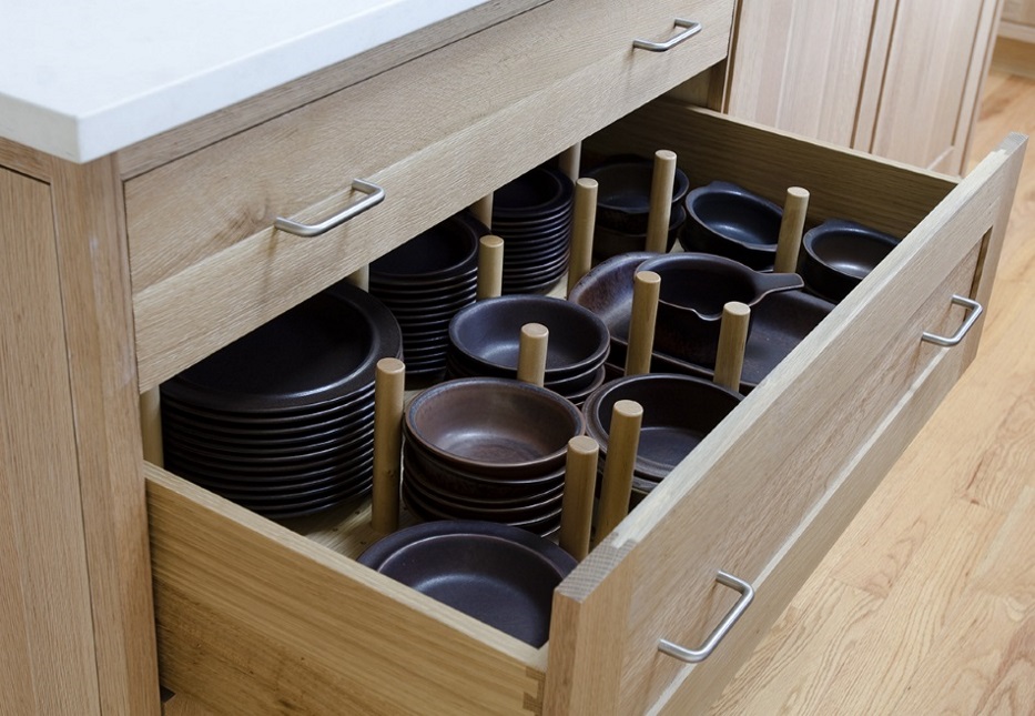
No complaining if you haven't done a thorough kitchen purge in the last year. We all have "stuff" and if it never sees the light of day it's stagnant energy taking up real estate that could be otherwise useful or beautiful.But what about dishes? They always go in the upper cabinets. Actually, dishes work perfectly in drawers if you have this drawer peg system. You'll find that they're easier to access too, particularly if you're short like me ;)
Dish drawer, dish pegs, black plates, drawer cabinet
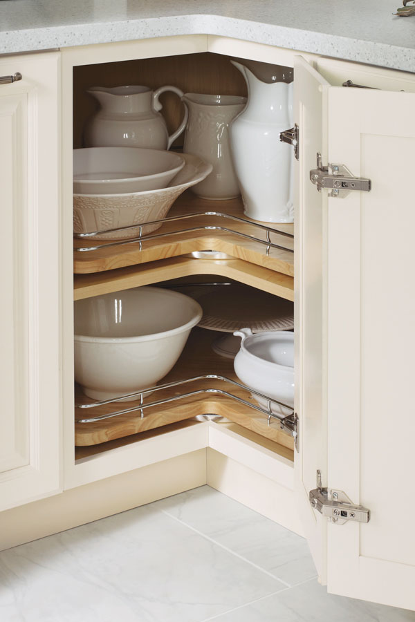
Clever Corners
Another way to maximize the space you have below deck is to use the corner space. My favorite way to do this is with a base lazy susan cabinet. It's versatile storage for almost anything. Just be sure to get this type, without the pole. With trays mounted on shelves, you won't lose things to the Twilight Zone if they fall over. (Chrome rails are optional) The only caveat is that you will need 36" on both sides of the corner to make this work.
base corner cabinet with lazy susan chrome rails
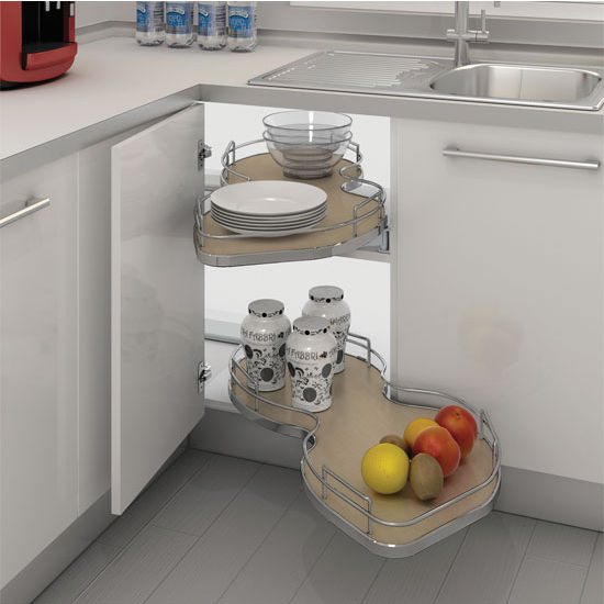
If you can't swing the 36" in each direction you can perhaps use the Cloud which fits in a blind corner cabinet. We can discuss more when you call me to help you with your new kitchen.
white cabinets, contemporary, chrome, blind corner cabinet, revashelf
Ultimate Simplicity
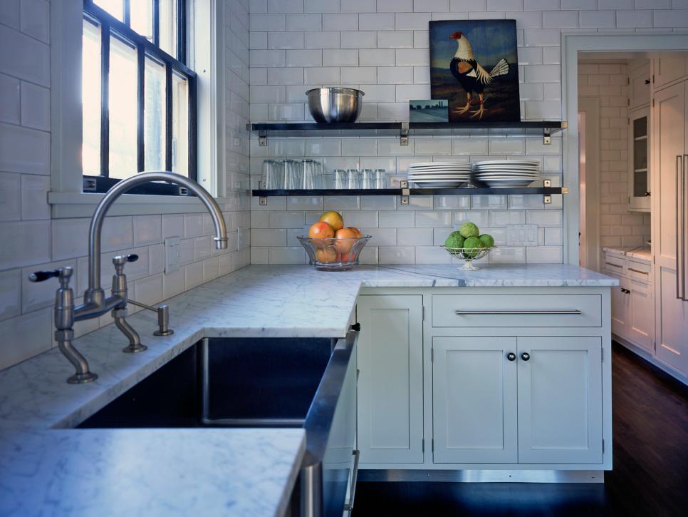
The most simple solution of all is the open shelf. They are both feared and widely popular. Some feel like it would look way too messy but I say it doesn't have to be all or nothing. A few open or floating shelves can add a lot of lightness and visual interest as well as storage above the counter in lieu of cabinets.
farmhouse kitchen, HGTV, white cabinets, apron sink, open shelves
Artful Arrangement
In the photo below, they actually did not eliminate uppers entirely but it feels like it. Here they are using the shortened uppers for remote storage, i.e. the stuff you don't need to access every day. The "go to" storage is in tall pantry cabinets. That's right, you don't have to use the pantry only for food, they are great for everything. If your pantry is full depth, like these, rollouts work great for easy access and to avoid items getting lost in the back. If you're observant you'll also notice the last cabinet sits on top of the counter. If you have the counter space this is a great way to conceal countertop items for less clutter.
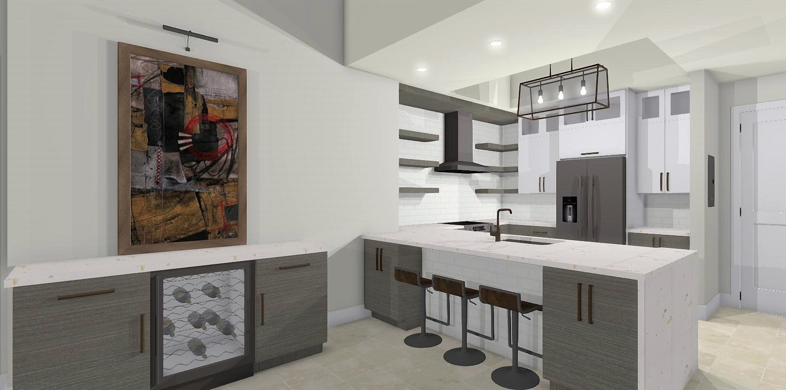
As we've seen, one does not necessarily need to banish the upper cabinet entirely to score an updated and functional result. Here is a loft kitchen I recently designed. My clients were in love with the idea of floating shelves and this look worked for their urban vintage style. Since space was at a premium in this condo we did opt to keep a few good sized upper cabinets. The look is actually a blend of contemporary and transitional. A full pantry also would've worked to the right of the refrigerator but my clients preferred this arrangement which is very symetrical and offers a bit of extra counter space. Hey, I always say the best jobs are good collaborations. :)
ArtfulKitchens 3DRendering kitchendesign
.
No matter what your situation, creativity can offer you choices. In over 20 years I have found that there is always a solution that will work in your space and I would love to help you find it.
It's time for Part FIVE!!! I know how patiently you've all been waiting for this new installment of The Big Move. It's been a challenging week including a meltdown that turned a Phase two project into a Phase NOW situation.
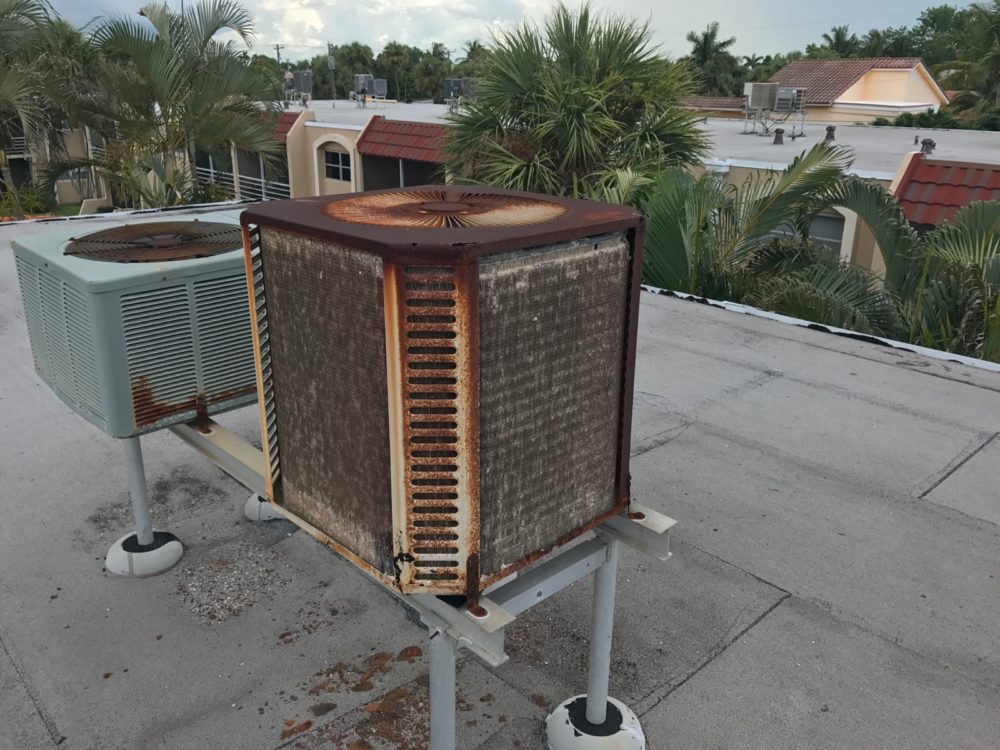
It's July in FLA and we just had to address the AC situation so as not to lose our dearly beloved labor force (Bob). The result of the first service call yielded a $99 bill and no relief from the heat. Granted the AC unit, we've discovered, looks like THIS!
We need a new 2 1/2 ton unit and were quoted $6,500. Next up, the second service call. For this one, we called a smaller company who we have worked with in the past and guess what? He's actually got the current unit working for the time being. In fact, it's been cooling for about 5 days and counting so Bob is cool for now and we'll see what number two's estimate is. I have high hopes since this AC guy is apparently a miracle worker. I digress. This week I promised a peek into what exactly is going on in the bedroom and master bathroom, which, to be sure, is a mini master. Check out the tricks, tips and snarky commentary by editor Joe and see what we are doing to make small work in a big way.
As promised, here are the products we're using as mentioned in The Big Move Part V:
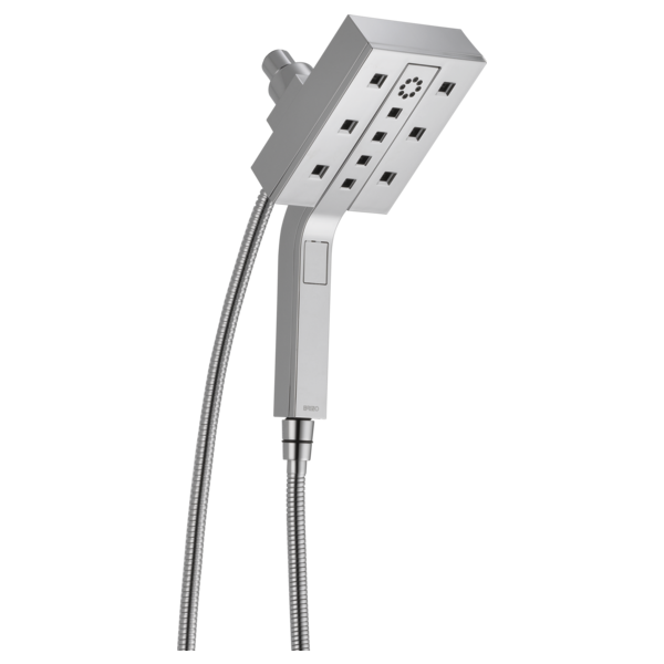
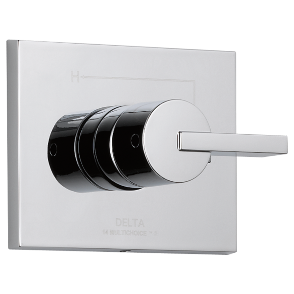
In the spirit of full disclosure, this showerhead was gifted to me by the lovely peeps at Brizo faucet a few years back. It's our style, works great and we love it so it's moving with us. The center portion pops out for hand held function. It comes in chrome (above) and polished nickel. Brizo is a part of Delta Faucets offering some really cutting edge design options but I actually love what Delta offers in their main line and it's what we chose for the shower and sink faucets.
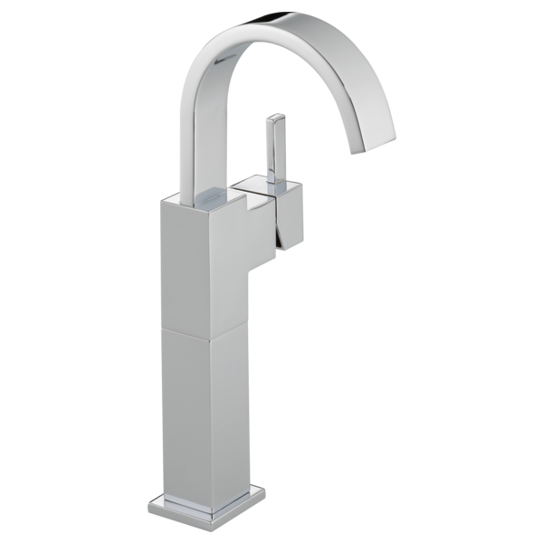
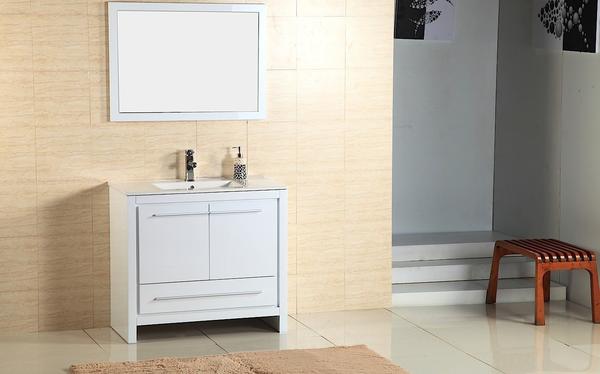
We went with a single hole/handle model as it is what will work with our furniture vanity which is pre drilled and looks like this.
It comes with matching mirror and is a high gloss white finish which will look great with the shiny shower tiles. Furniture vanities can be a great solution if they work with your space as you have the counter top and sink already done and included in the total price of your vanity. The shower also will have the matching Vero design. I love the Vero styling because it incorporates square clean lines as well as the softness of the circle. I want it all!
We didn't want to sacrifice any precious space for a shower bench but a girl's gotta shave her legs, right? I plan to get this cute shower stool. I love the fact that you can move it.
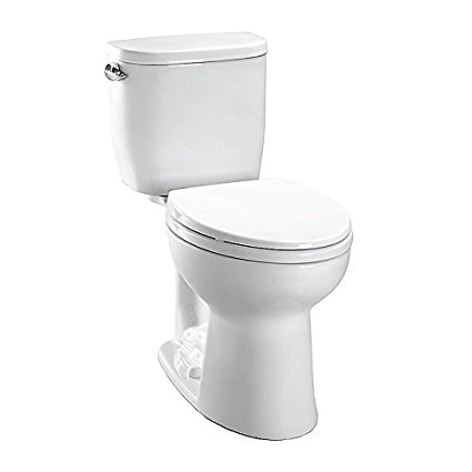
So now for the toilet. As Joe so accurately pointed out, we did not, in fact, end up with a skirted toilet. I thought that's what we ordered but it wasn't. I'm okay with this and truthfully just thrilled to have a Toto toilet. It is, however, a compact model just perfect for small spaces with a tank that measures just 14 1/2". Incidentally, we also had an outlet put in right next to the bowl for a future Washlet and if you don't know what that is you should and you can read all about it here.
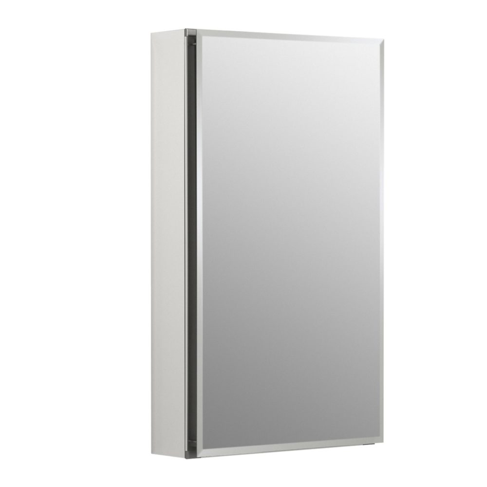
Since storage is at a premium we're going to include this mirrored medicine cabinet over the toilet.
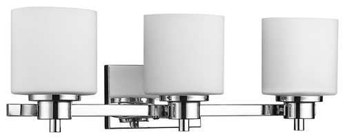
Last but certainly not least is the light. I thought this lovely fixture was just the right style and size to illuminate this artful mini master bath.
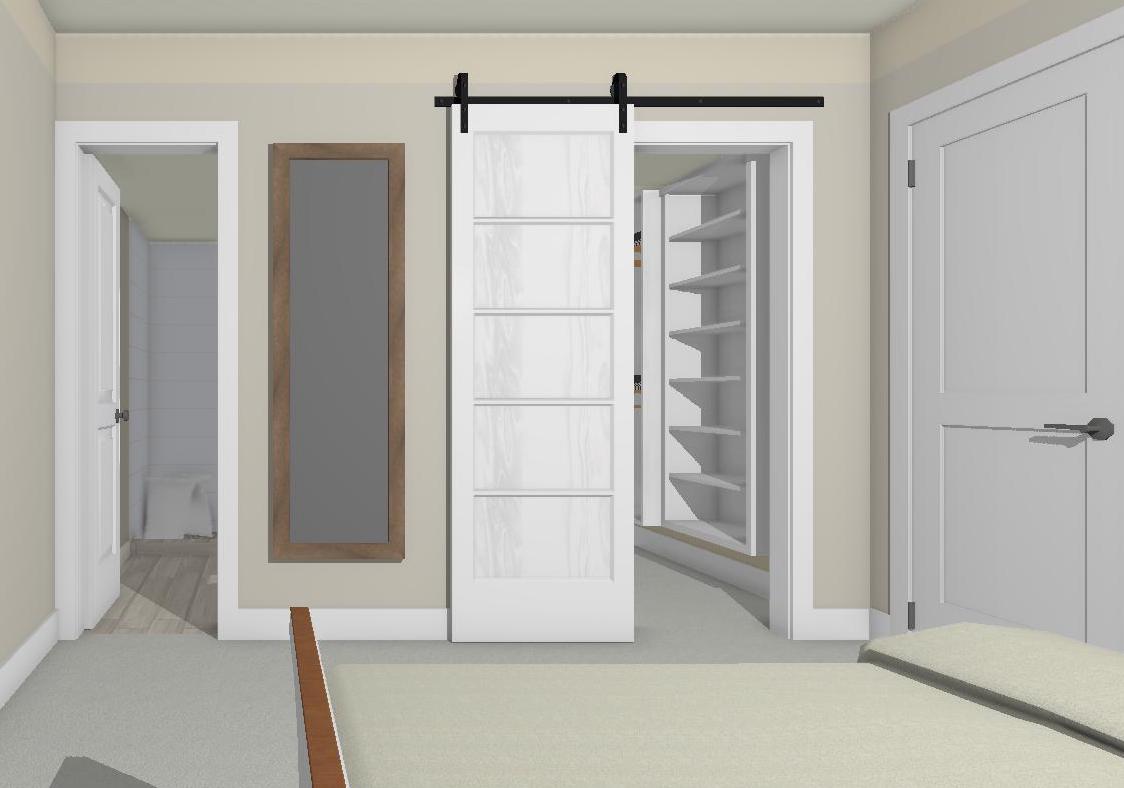
The barn door was an excellent solution for two doors that didn't get along very well! So there you have it! Please feel free to comment. I'd love to hear your thoughts and don't forget to subscribe to the blog for more tips tricks and some upcoming behind the scenes revelations of this Artful Kitchen designer. xoxo
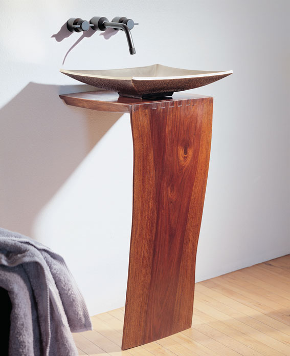
This gracefully elegant vanity is the epitome of simplicity and minimalism.
This natural sculptural vanity features the "live" edge of a tree bark. It comes with a unique natural artfulness which can read rugged yet delicate at the same time. It is available in two heights. The butterfly joints ensure stability. The lovely delicate bronze Zen Vessel sink is a perfect partner and has been hand crafted using traditional sand and casting techniques. What do you think? I think it could be lovely in just the right situation, perhaps like this one inspired by the kimono.